Tuesday, November 4, 2014

Creating Pie Charts


Pie charts are used when we have a finite number of the population that we are wanting to examine (IE, a fixed amount of pie). Consequently, a variation in one variable directly affects the other variables. If you eat a portion of the pie, you can't get any more without making a while new pie. Get it?

Today we will be looking at cell phone usage, specifically, which cell phones students use. First, we'll need to take a poll of our sample set. In this case, it will be our class. For the purposes of this exercise, we'll use this set of hypothetical polling data from a class of 23 students. If you have real polling data, use that instead.

Android 10
iPhone 7
Windows 3
Other 3

Now, to create a pie chart, we'll have to use Google Sheets. Follow the following steps:
  1. First, open your Google Drive and create a new Google Sheets file. Rename the file Cell Phone, and place the file in your charts folder. 
  2. Next, enter the phone type in the first column (A). In column B, enter the number of phones.
  3. Now, click on A1 and then click on B4 while holding down the shift key.
  4. With the data selected, click on the Insert menu and click on charts and select Pie Chart.
  5. Select customize and change the chart title to  Cell Phone Market Share.
  6. To save the chart as a .png file, click on the small down arrow in the upper right hand corner and click Save Image. Save the chart to a local Downloads folder and then upload it to your Google Drive.
  7. Congratulations! You're done!
Make sure your work is turned in by the end of class. If you have time, try changing the colors by clicking on each section. You can also change the chart to a bar chart by selecting a different type. Try it!

Your classwork will be graded on the following rubric.

Accuracy of the data. 0-4
Proper chart labeling 0-4
Proper spelling 0-2

Total 10 points

Monday, October 27, 2014

Histograms

Histograms are another way of visualizing data. Watch this video to get a better understanding of when and how they are used.


So now that you know what a histogram is, its time to create one for yourself. Take a look at the following table. This is a breakdown of the number of Freshmen, Sophomores, Juniors and Seniors in a series of Applications classes.

Class 1
Freshmen 5
Sophomores 7
Juniors 3
Seniors 2

Class 2
Freshmen 13
Sophomores 8
Juniors 2
Seniors 1

Class 3
Freshmen 4
Sophomores 11
Juniors 2
Seniors 2

Class 4
Freshmen 8
Sophomores 3
Juniors 4
Seniors 0

Assignment:

Create a histogram for each class using Google Draw. You may put all four histograms on a single 8.5x11" page. Use color to differentiate the classifications. Remember that one of the primary differences between is bar chart and a histogram is that there are no spaces between the bars on histograms.

Open up a Google Docs file. Write an analysis of the data answering the following questions:

1. What seems to be a similar trait of all of the classes. What would you say is true of all the classes in general?

2. Do any of the classes stand out for any reason? Explain your answer using the data provided.

3. How does the histogram help you understand the data?

Sunday, October 26, 2014

Creating Bar Charts


One of the difficulties in presenting the results of research is explaining the numbers. Many people understand data visually so it helps to show numeric data visually. One of the best ways to show data is though a bar chart. You can read more about bar chars here:

http://www.mathsisfun.com/data/bar-graphs.html

Recently the Commonwealth Fund released some interesting data comparing the relative quality of care in 11 industrialized countries. Examine the chart below.

Take a look at the chart, particularly the section that shows the "expenditure per capita." How could a bar chart better show the expenditure per capita?

Assignment:

Create a bar chart in Google Draw showing the per capita expenditure for health care in each of the 11 nations shown in the graph above. Use various colors to differentiate the nations. Here is an example of what you will produce.

https://docs.google.com/drawings/d/1tn1-4LyHCGAqoNeQJuIxos17QmmUEmgpyLL3fTCzP7s/edit?usp=sharing

You should be able to re-create this bar chart with the skills you already have.

1. Create a new folder on your Google Drive, label it Charts.
2. Create a new Google Draw file and label it Bar Chart.
3. Use the sample I have provided as an example.
4. Share your Charts folder so I can inspect your work.


Rubric:

Nations are listed correctly 0-3 points
Data is entered accurately 0-3 points
Bars are set correctly 0-4 points

Total points available 10

Now, Check this out when you're done.


Thursday, October 9, 2014

Brochure Basics

Three panel brochures are a very easy way to get your message into the hands of customers. Creating them can be a little tricky though.


 The easiest way to lay one out is to create a blank brochure using a plain piece of paper. make the overleaf panel slightly smaller than the front and back. The overleaf should measure approximately 3 5/8". To finish the other fold, simply fold the folded edge to the opposite side. 

After you finish the blank prototype, label each panel so you can keep up with the inside and outside. Create your page in Google draw or Google Docs and you're ready to start designing.

Assignment: Put your school map into the form of a three panel brochure. Create a cover and back with the school name. On the overleaf, put a welcome message. Save the finished file to your maps project folder.

If you like, you can copy a template to your Google Drive using this link:

https://docs.google.com/drawings/d/1-kpFHdEU9HPNr-Va92zNeldygVQ9optUedFd2oPI0kA/edit?usp=sharing

Tuesday, October 7, 2014

Directional Signs

It takes more than just a good map to navigate an unfamiliar space, you need landmarks in order to orient yourself  to the space on the map. Directional signs can help visitors navigate an unfamiliar space. Study the directional maps below.

How does the use of color help visitors understand landmarks and directions?
How could you use these signs if you could not read or didn't understand the language?
How can symbols be used to help communicate?


Assignment: Create a system of directional signs that you could use in your school. Use color, symbol, or alternative languages to help visitors navigate the space. Show the system of colors, symbols and sign design that you would use and match them up to the map you created earlier. Make sure that you could use the system to create any sort of sign needed. Show how your signs would look at 5 intersections. Indicate where and how they will be mounted.

Sunday, October 5, 2014

Finding your way with maps

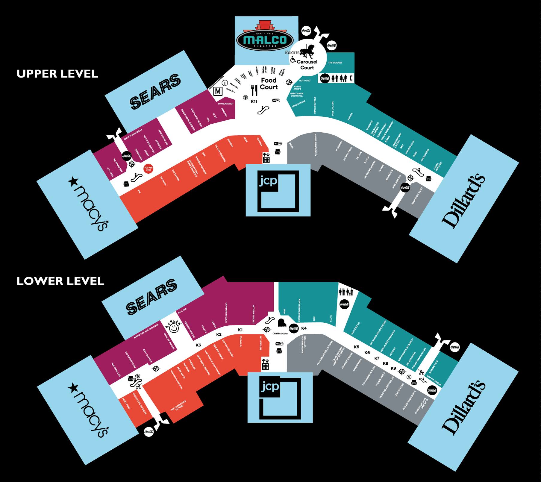
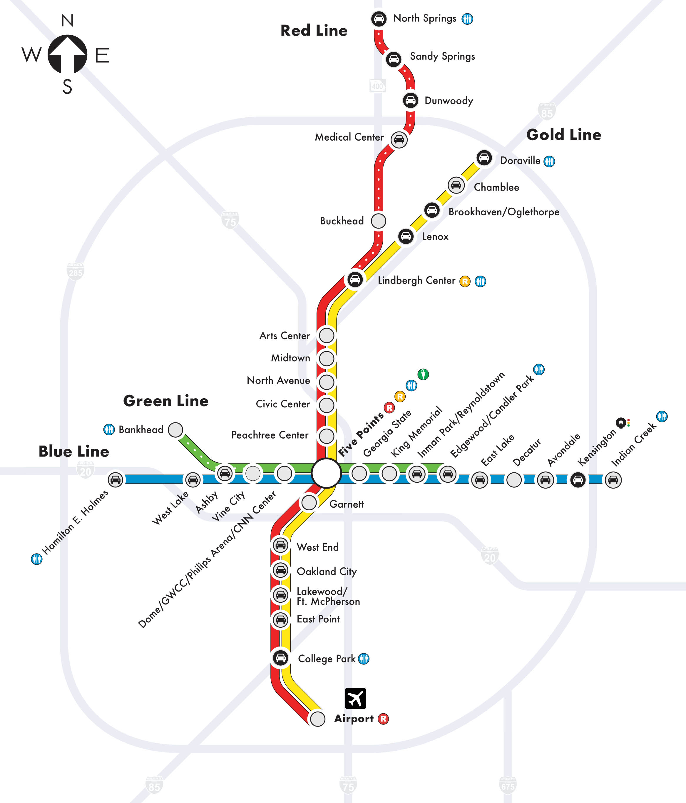
Have you ever been to an airport or mall that you are unfamiliar with? If you're like most people, you found your way around with a simple map. Many public buildings and transportation centers use simple maps to help people navigate complex buildings and cities. Study he maps below. Notice the use of simple shapes and colors to organize large and complex spaces.

Memphis International Airport


Wolfchase Mall - Memphis, TN

Metro Atlanta Rapid Transit


Washington Metro 


FedEx Forum - Memphis, TN

Naga City School


Assignment: Think about your school. How could you create a simple map to organize the space to help people orient themselves and find their way? Use Google Drawings to create a simple map using lines, shapes and colors to help visitors find their way. Organize the classrooms by subject using color. Assign specific colors to the administrative and recreational portions of the building. Mark places of interest such as restrooms, and entry/exit doors. Place the map on an 8.5x11" page. Title the file School Map and place the map in a shared folder titled Map Project. Turn in this project by the end of class.


Wednesday, October 1, 2014

Extend your knowledge

Try creating a totally new soccer schedule poster for Haywood High School. You may use the resources below:


Soccer Schedule:

http://www.haywoodschools.com/page.php?pageid=94

Use any fonts you like as long as you make it effective. Size it at 8.5x11 portrait or landscape. Drop your finished poster in your Posters folder by the end of class.